
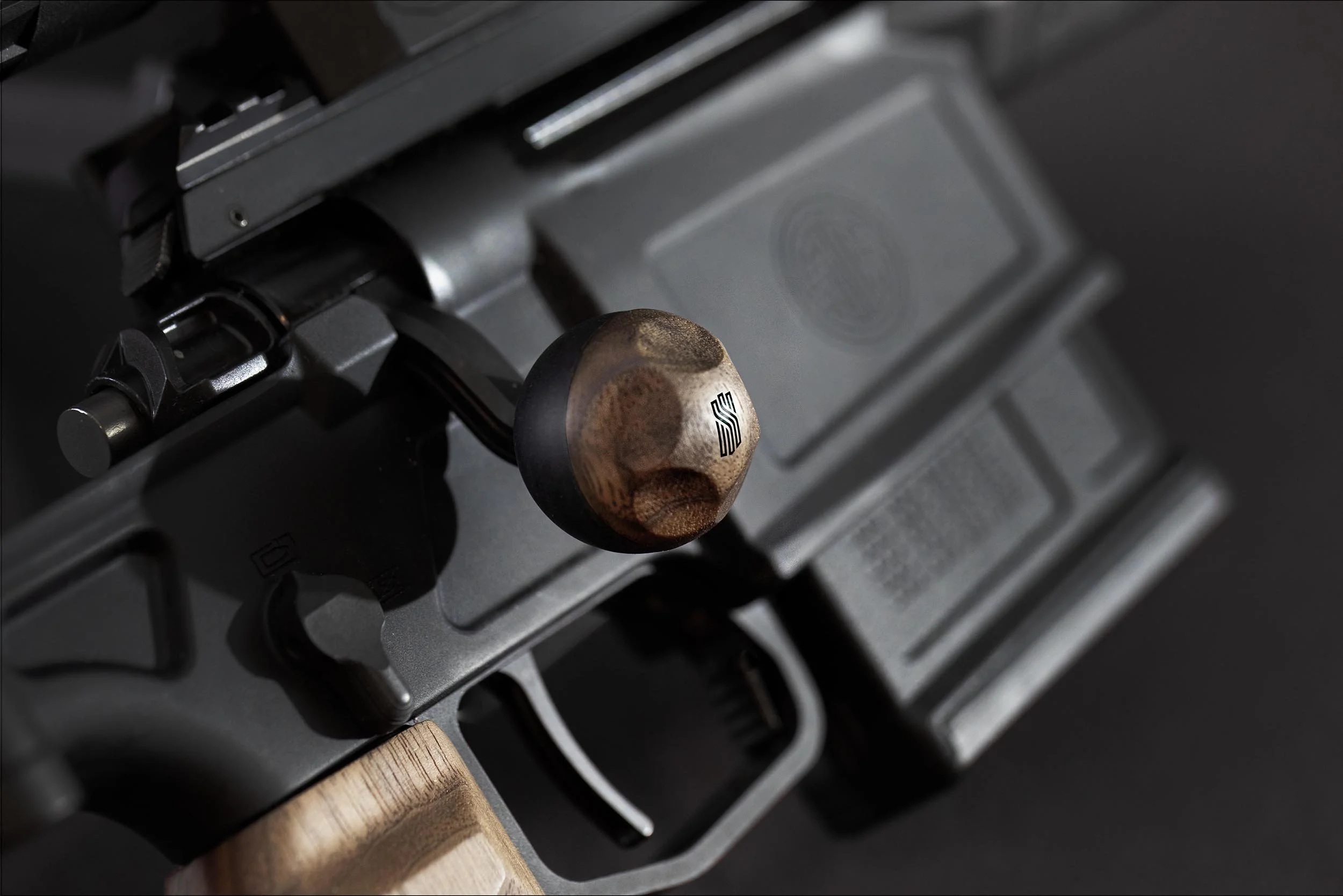
Challenging an established category.
BRAND IDENTITY-LAUNCH 2025
Spada Scura is a premium rifle-accessory brand for modern bolt-action platforms. I led it from strategy through launch. Positioning, identity, packaging, website, and product photography.
RoleBrand Strategy & Identity design — strategy through launch
Naming, positioning, identity, packaging, website, product photography
Discipline2024-2025
Year01 / The challenge
A CATEGORY BUILT ON AGGRESSION
Credible to serious shooters, without the tactical cliches.
The rifle-accessory category is dominated by aggressive tactical styling, black polymer, and utility-first messaging. Spada Scura needed to feel credible to serious shooters while making room for craftsmanship, refinement, and premium materials. A territory the category rarely enters.
02 / The strategy
Spada Scura means “Dark Sword” in Italian. I used that idea to build a brand around controlled performance rather than aggression: dark purple, restrained typography, walnut, and machined metal created a premium language that still felt credible on a working rifle.
DARK SWORD
Controlled performance, not aggression.
03 / The Mark
LOGO & SYMBOLISM
A shield built from the founders’ story.
I developed custom letterforms that extend the visual language of the logo, incorporating subtle blade-like details that connect to the Spada Scura name. The shield contains a hidden SS monogram. Its three central pillars represent the three founders, while the base forms three swords.
3 — pillars in the shield, one per founder
04 / Photography
STUDIO & COMPOSITING
Showing the grain. Showing every platform.
Standard product shots flattened the walnut, making its grain and detail difficult to see. I photographed each piece in a controlled studio environment using a macro lens to reveal the wood’s texture, natural variation, and character.
The products were designed to be compatible with a range of modern bolt-action platforms. The challenge was demonstrating that versatility across several rifle brands without significantly increasing the production budget. I photographed each product in the studio, then used digital compositing to create realistic application imagery showing how it integrates with different compatible platforms.
05 / Packaging
AN EXTENSION OF THE PRODUCT
Packaging built to be reused, not thrown away.
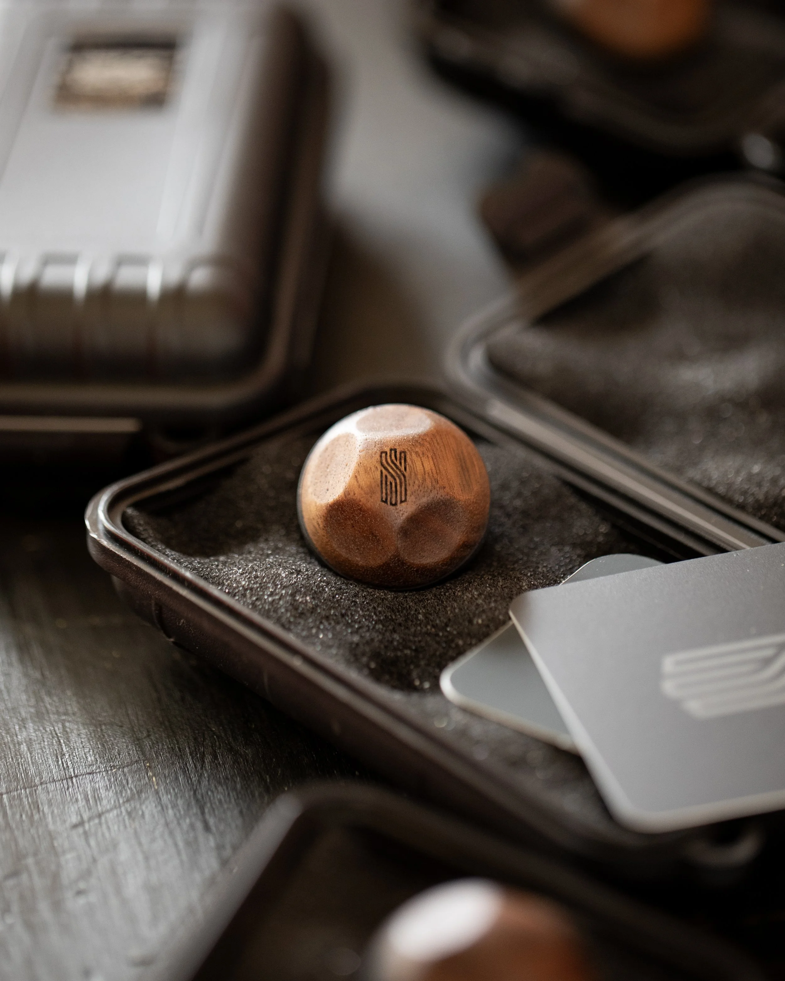
The packaging was designed as an extension of the product rather than something disposable. I chose a rugged plastic case modeled after a firearm case that could later be reused to store spent brass — a practical benefit for long-range shooters who reload.
I also designed a clear, easy-to-follow instruction manual with installation steps and a complete inventory of the included hardware.
06 / Community
THE ACE OF SPADA
A reward that can’t be bought. Only earned.
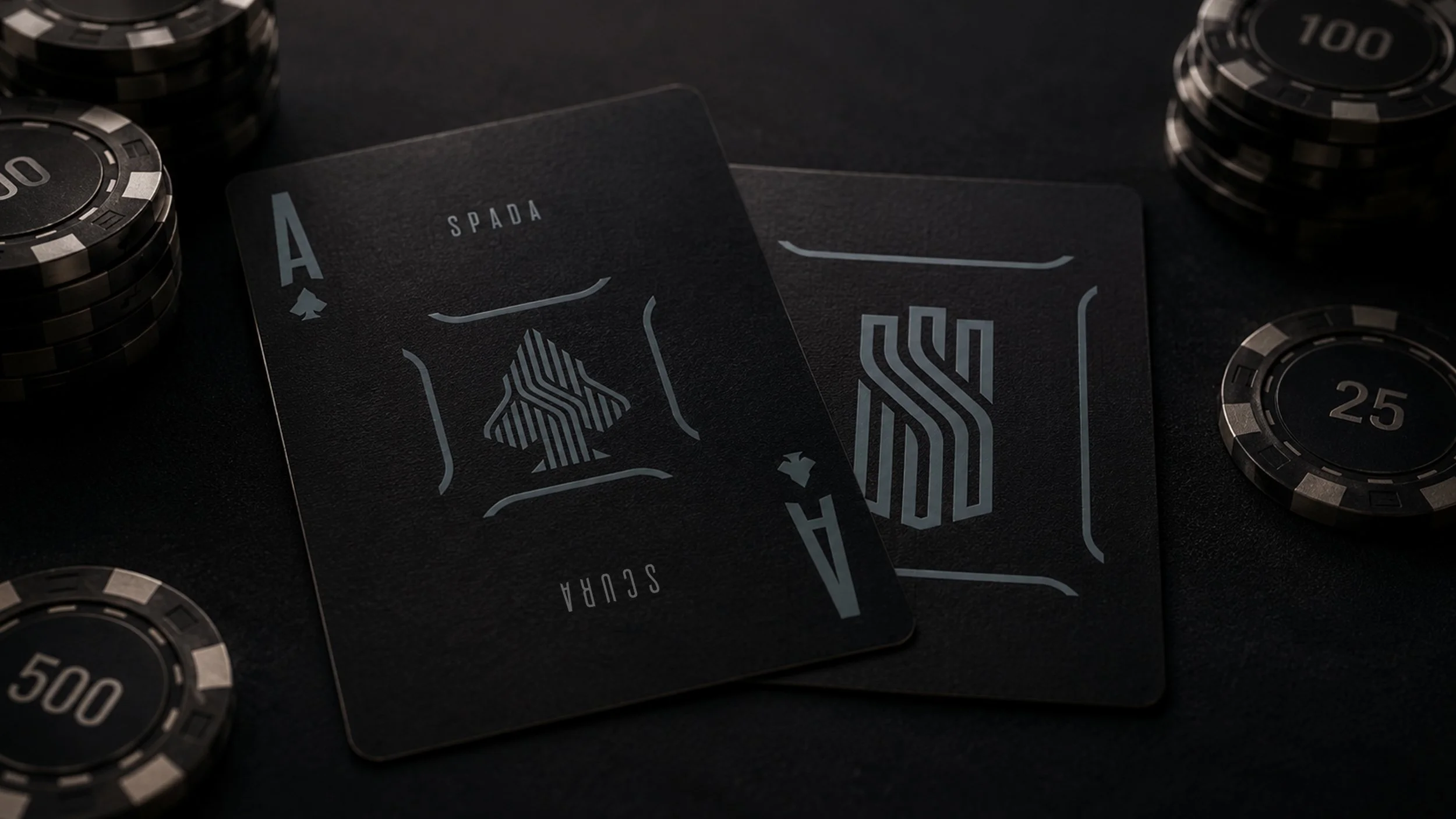
The Ace of Spada is a community campaign that turns every purchase into a challenge. Each order includes a set of Ace target cards featuring the Ace of Spades mark.
Customers are invited to hit the mark from 100 yards at an appropriate shooting range and submit a video confirming the shot. Those who complete the challenge receive an exclusive Ace of Spada hat unavailable to the general public. It cannot be purchased. It has to be earned.
100 yards — the distance of the Ace of Spada shot challenge
07 / Result
WHAT CHANGED
A complete premium brand, from concept to market.
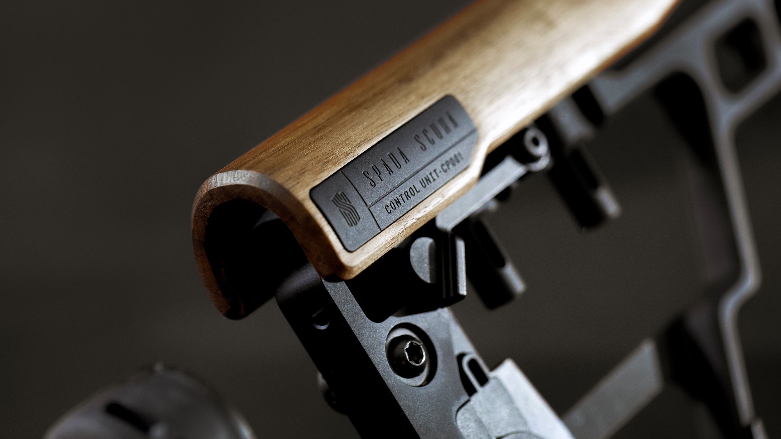
Spada Scura moved from concept to market as a complete premium brand, with every customer-facing element built around one consistent position.
Secured a partnership deal with SIG SAUER.
Built every customer-facing element around one consistent position.
Showed compatibility across several rifle platforms without producing a separate photo shoot for each one.
Extended the brand through reusable packaging and the Ace of Spada customer challenge.