UBE x ICE
Overview
UBE x ICE is a premium halo-halo brand in development for catered events and future retail. Its long-term goal is to make the Filipino dessert as familiar as boba, gelato, or mochi.
I led the naming, positioning, identity, packaging, event system, uniforms, and vehicle graphics.
Challenge
Halo-halo can be difficult for newcomers to understand. Its 12–18 ingredients can look overwhelming, the traditional glass can be messy to use, and its colorful layers lose their visual appeal after mixing.
Solution
The name uses the growing familiarity of ube to make the product easier to understand. Ingredients are displayed individually so customers can see what they are choosing and customize their order. A simple identity, frosted cup, and Filipino cultural details make the experience approachable without stripping away what makes it authentic.
Outcome
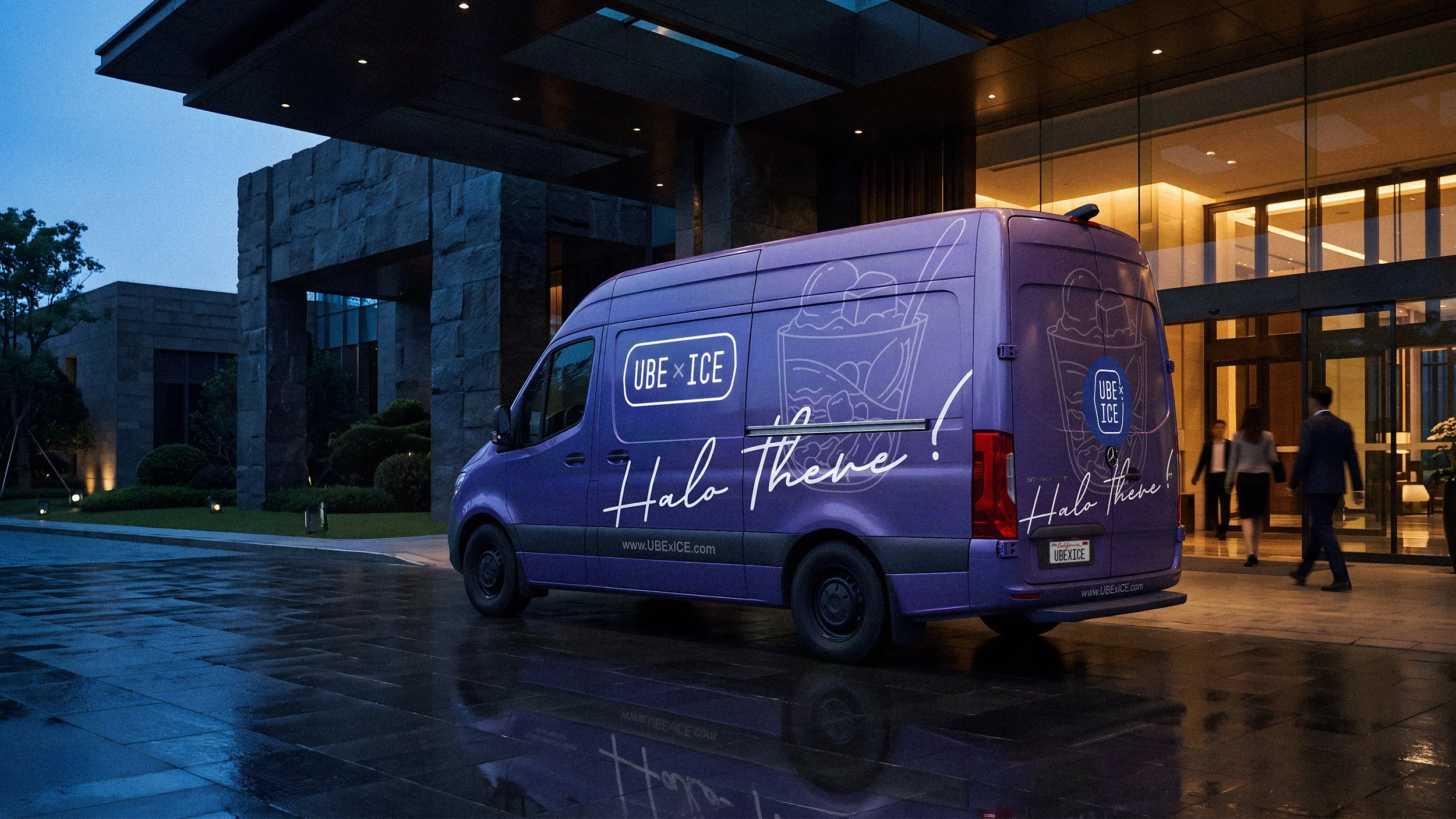
Built a connected brand and service system spanning identity, packaging, menus, uniforms, vehicle graphics, and events.
Designed a compact bar that one person can transport, set up, and operate.
Created a clearer ordering experience around an unfamiliar product.
Integrated Filipino language, ingredients, and cultural stories throughout the customer experience.
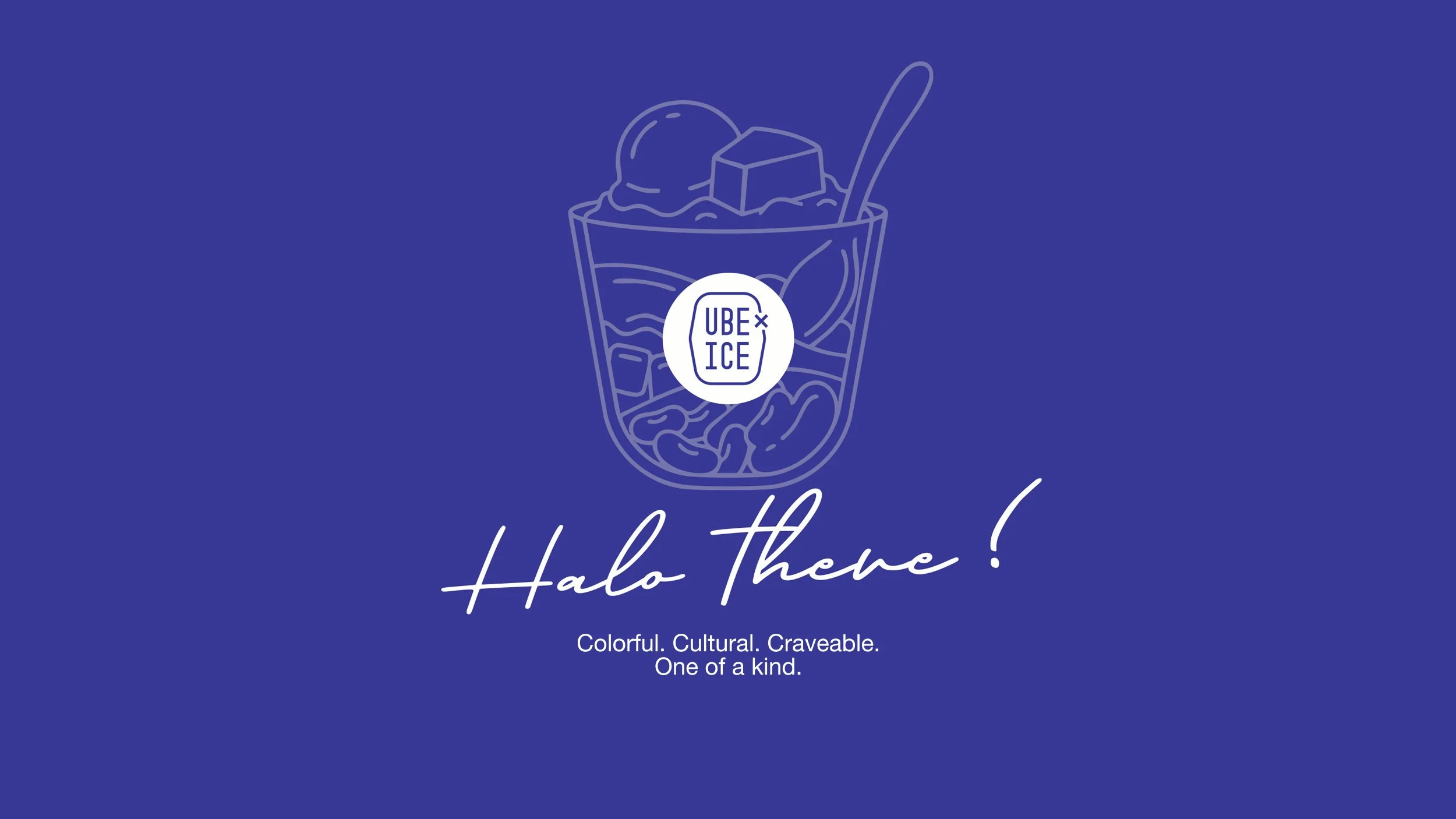
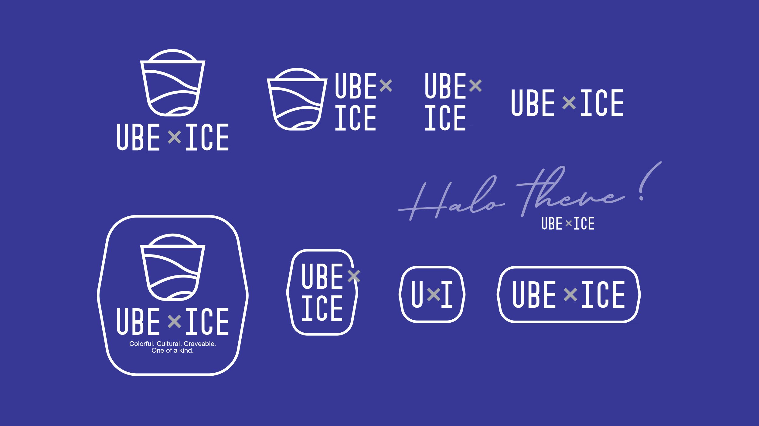
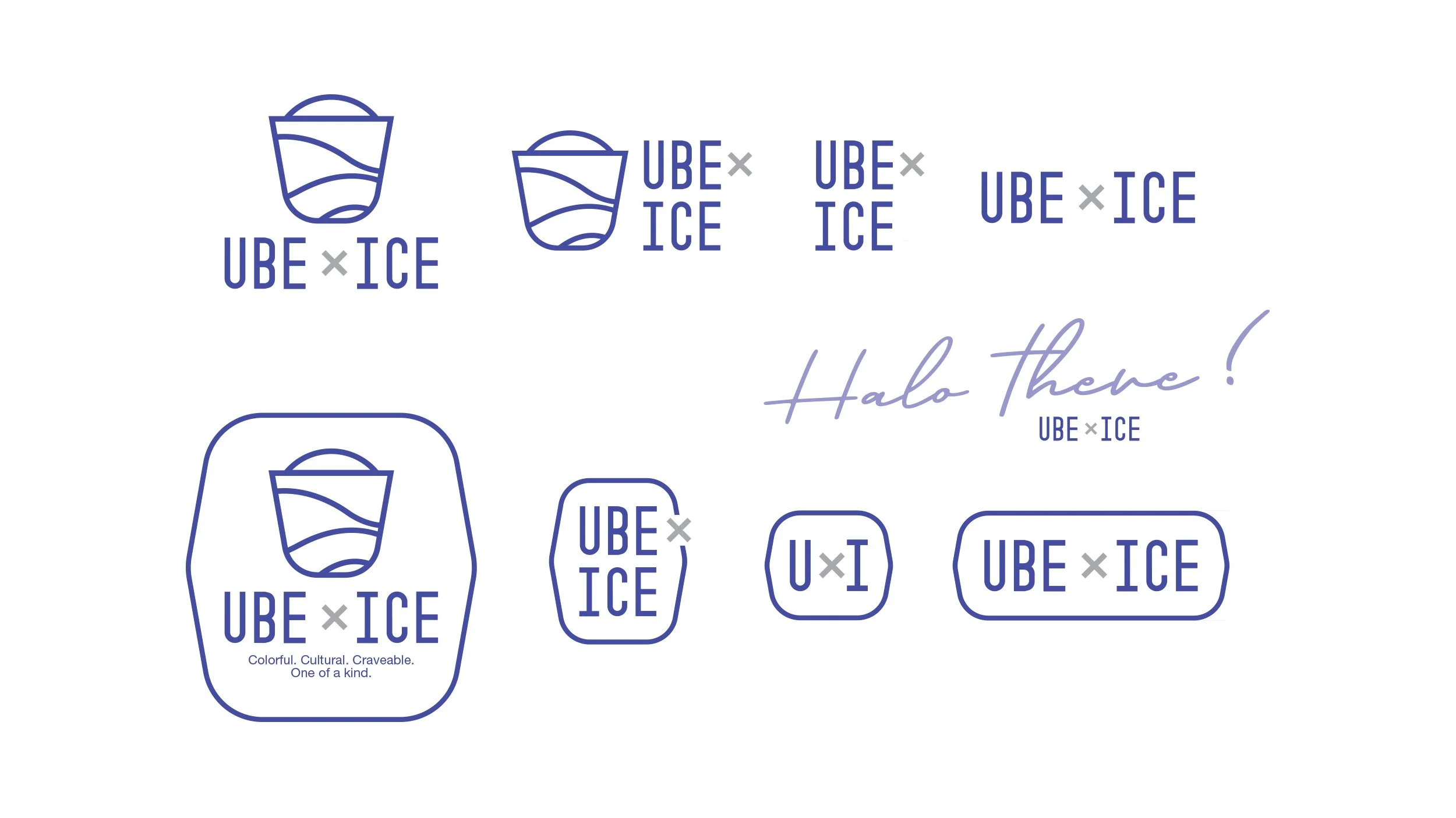
The logo was intentionally kept simple to balance the visual complexity of halo-halo. Its cup-shaped mark suggests the dessert’s layered ingredients without illustrating every detail, making it easy to recognize and understand. The same form carries through the menu and the physical cup used to serve the product, creating a direct connection between the identity and the experience.
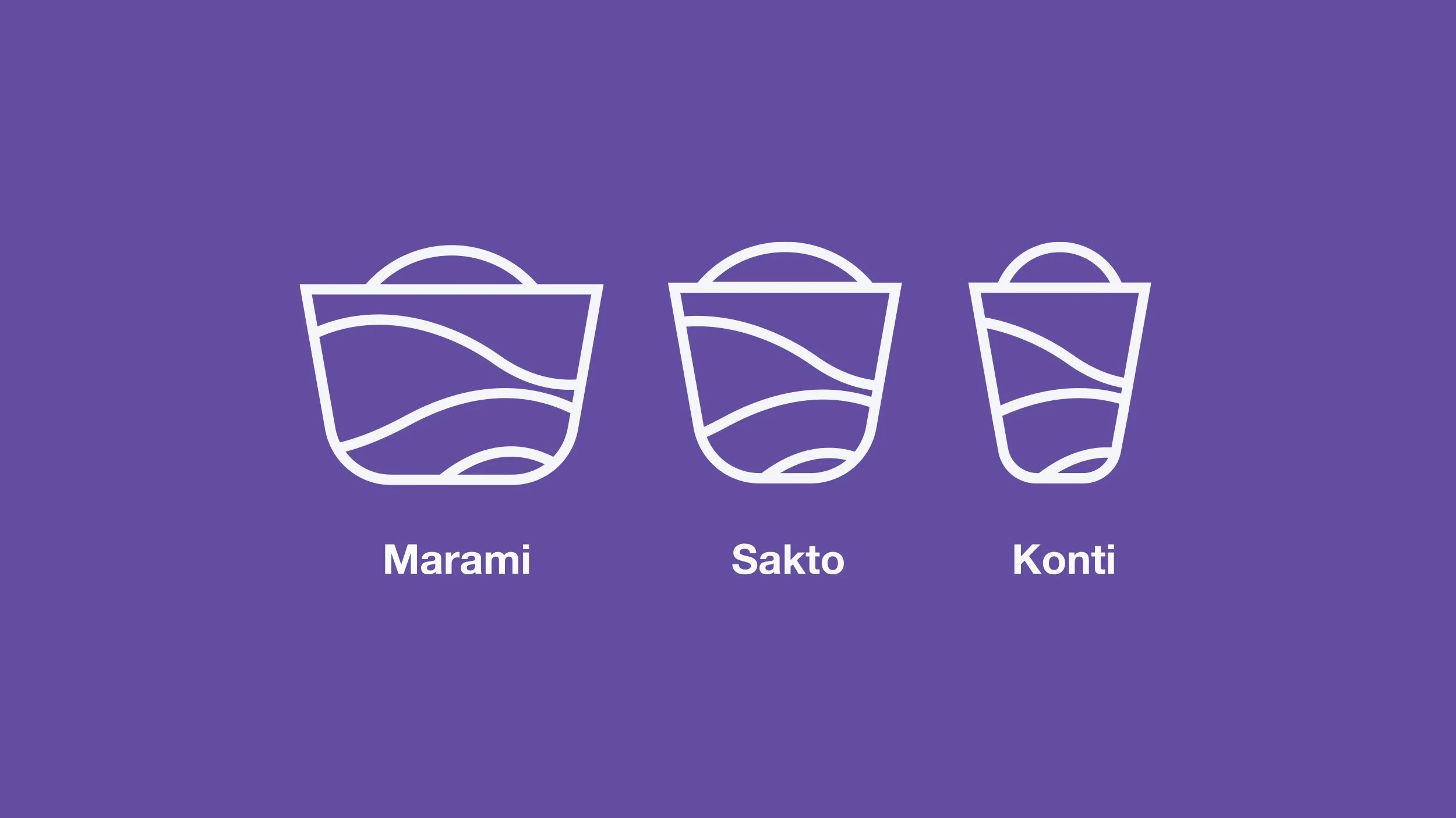
Instead of defaulting to small, medium, and large, the size system uses Tagalog words: marami for a lot, sakto for just right, and konti for a little. The cup icons make the differences clear, while the names introduce another piece of Filipino language and personality into the ordering experience.
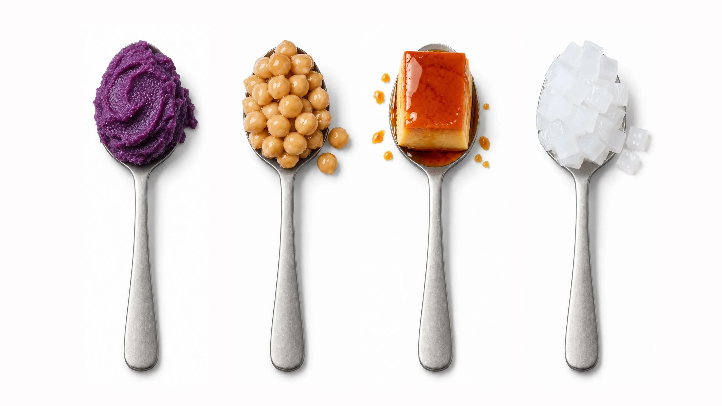
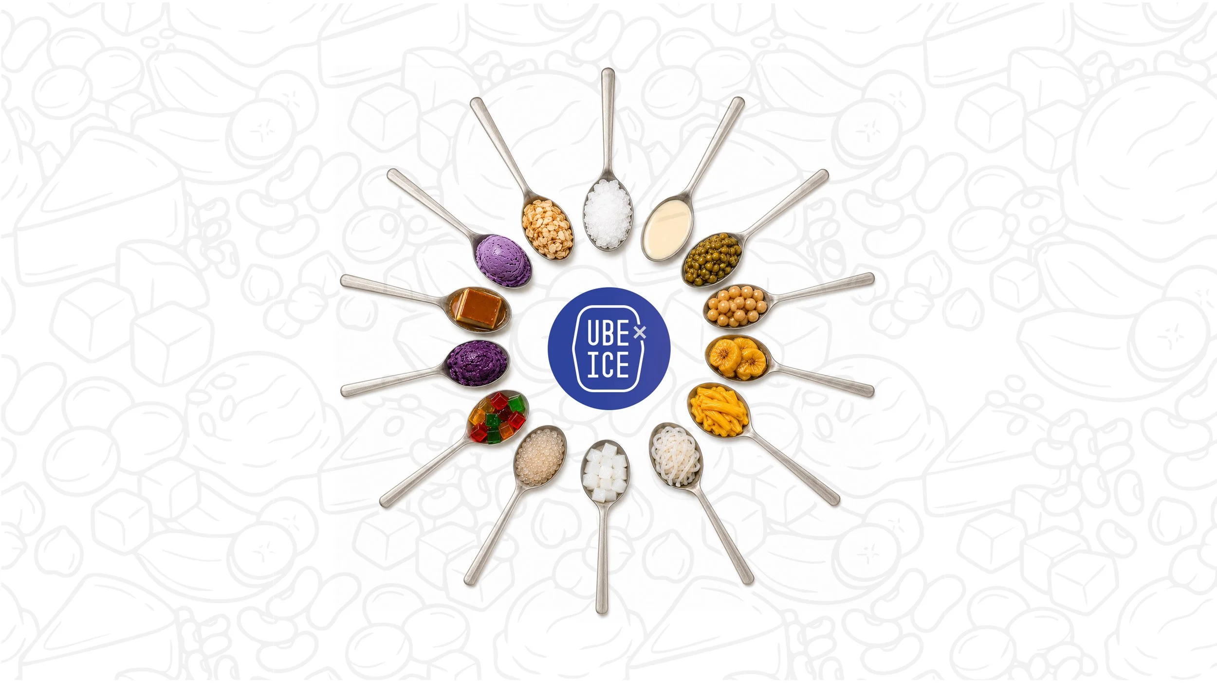
Displaying each ingredient separately makes halo-halo easier to understand and less intimidating. Instead of seeing one unfamiliar mixture, customers can recognize the individual flavors, colors, and textures that come together in the finished dessert.
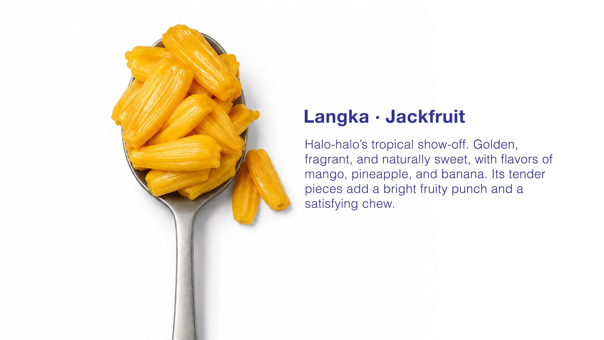
The spoon became the visual frame for presenting each ingredient. It creates consistency across the system while adding a subtle cultural reference. Filipino meals are commonly eaten with a spoon and fork, with the fork used to guide rice and other foods onto the spoon. Using it here connects the ingredient story to a familiar part of Filipino dining.
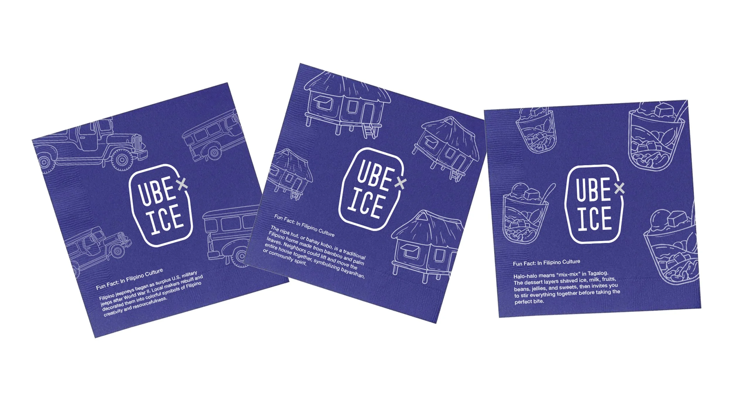
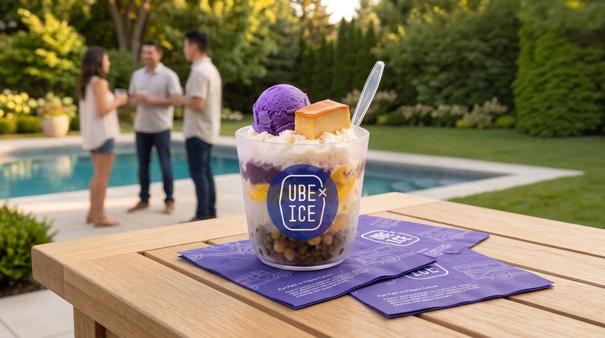
The goal was to introduce Filipino culture without making the experience feel instructional. Each napkin features a cultural icon, a short fact, or a bit of context about halo-halo, turning an ordinary touchpoint into a small introduction to the culture behind the dessert.
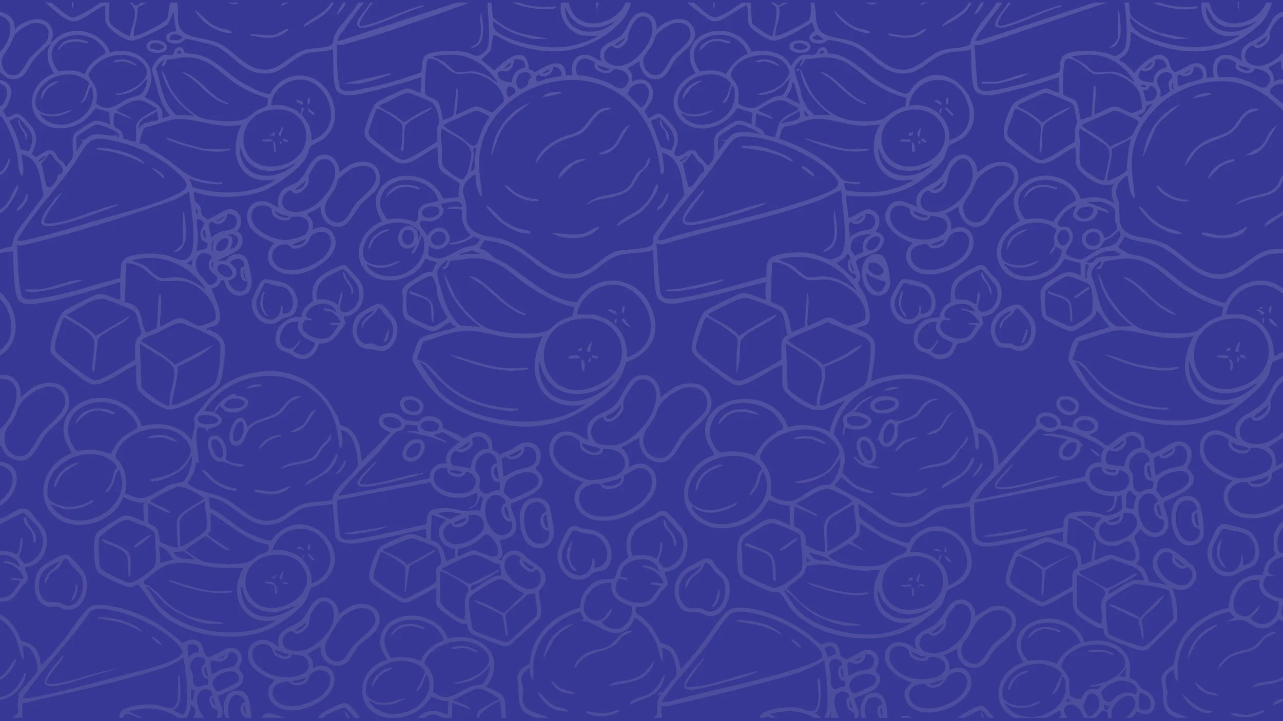
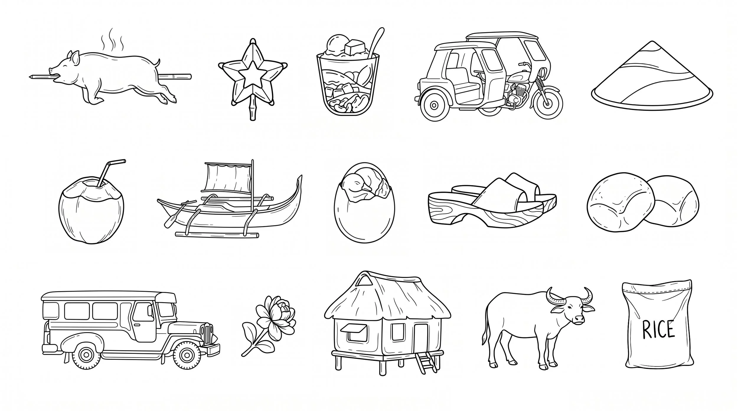
Illustrations allowed me to communicate the variety of ingredients in halo-halo while simplifying their presentation. It preserves the dessert’s sense of abundance without presenting every unfamiliar texture at once, making it feel more approachable to someone seeing it for the first time. It also gives the brand a distinctive visual personality and adds a sense of playfulness to the overall experience.
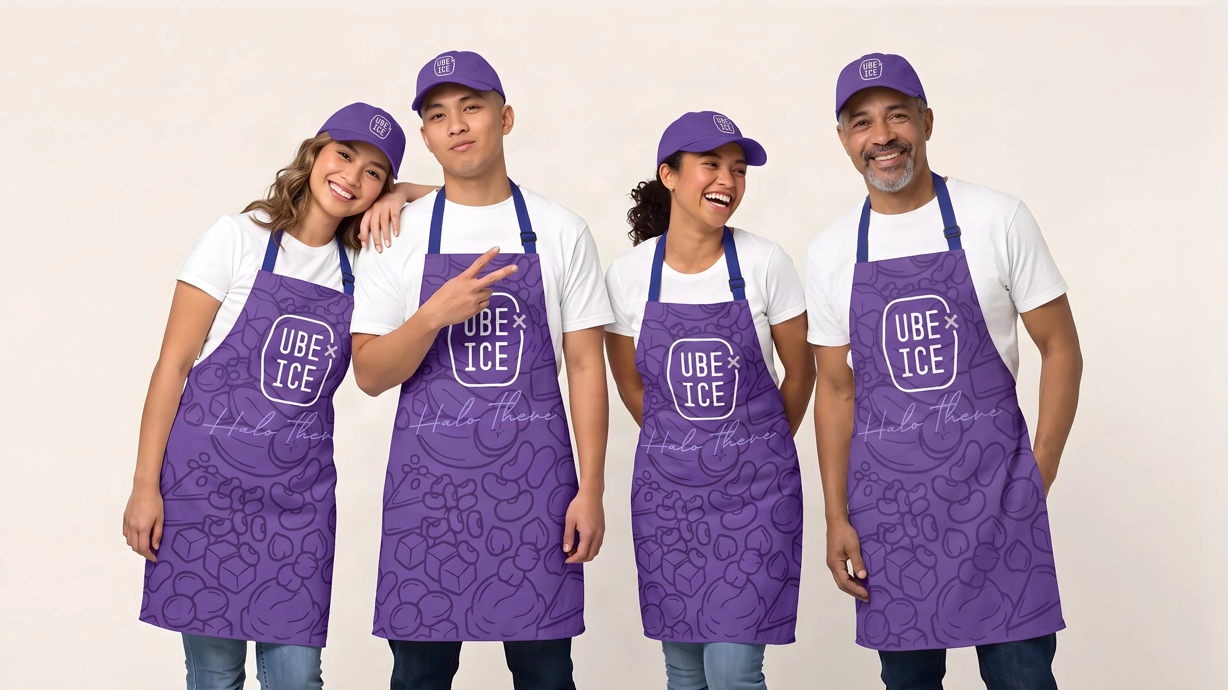
The uniforms carry the brand directly into the service experience. Clean white T-shirts keep the look relaxed, while purple caps and aprons create immediate recognition and make the team easy to identify. The illustrated ingredient pattern adds personality, giving the staff a polished, cohesive presence without making the experience feel overly formal.
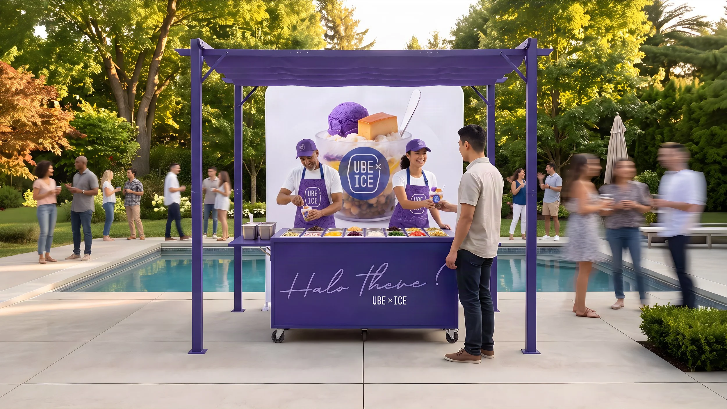
The booth and bar were designed as a compact, collapsible system that can be transported, set up, and operated by one person. At larger events, multiple stations can be placed throughout the venue to shorten wait times and increase brand visibility.
The person behind the bar is also an important part of the experience. Staff are trained to be welcoming and to explain what halo-halo is, how it is enjoyed, and its history and place within Filipino culture.